
Ocelott: Brand Design

THE NEED:
Ocelott is an Australian crypto-currency trading system built to allow investors to diversify their portfolios and programmatically make trades to maximize return and mitigate risk. It is the brain-child of Jesse Swan a Tasmanian data scientist with a dream and an algorithm, but he and his team needed a brand to help bring this project to life. Primarily, Ocelott operates as a trading app and is almost exclusively applied and interacted with in a digital environment.
THE REMEDY:
It was clear from the outset that this identity would need to be clean, distinctive, and replicable at many sizes and formats. We began with a series of hand-drawn conceptual calls before I began an exploration of potential options for the team to consider.
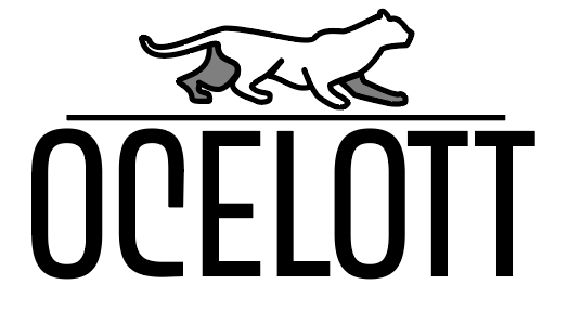


There were a dizzying array of options over the course of development exploring everything from text-only subtle options, to stylized cats of all sorts. In the end we opted to pursue a highly abstracted insignia with distinctive typography to allow the Ocelott name to become a truly open vessel for all of the great value their unique systems would imbue the brand over time.
THE RESULT:


In the end a distinctive, concentric design that only tangentially hinted at the brands namesake cat came out on top. A bold new identity, for a visionary new company. From there I applied this new insignia into a full brand package inspired by the founder’s homeland, Tasmania. I developed a striking two-tone color palette that will be easily applied across a myriad of user interfaces as the company continues to develop. Already the identity has helped bring their beta-version app to life with a cohesive look and feel that will help inspire development for years down the line.