Slifer Smith & Frampton: Print Materials

THE NEED:
In December of 2020, Slifer Smith & Frampton launched a rebrand that put their brand-new, and highly-valuable partnership with Forbes Global Properties front and center. When I arrived on the team they had a new logo lockup with the Forbes brand and set of brand standards ready to go, but not much else. To bring this partnership to life I was tasked with redoing materials across all platforms to bring a fresh new look, and consistent voice to all of their materials. In the world of real estate this entailed a large number of high-end print projects tailored to reach our audience at a variety of touch points.
THE REMEDY:
The Gold Standard –
The highest priority, and heaviest lift, by far was a complete rethink of the in-person presentation our agents used to solicit new listings, The Gold Standard. Previously this had been a cheaper saddle stitched piece with inconsistent design so we determined it was time to really move the needle on this super high-value touch point. I began by working with our Broker Development Team to run a series of focus groups with our most engaged agents to determine what they would find most value. Out of these meetings compiled a content outline, and a new form factor the over-sized spiral-bound piece you see below. From here it was on to design.
I redesigned the piece wholly from scratch with a new look and feel that would go on to inform our brand standards, and stylistic choices in materials for years to come. My goal was to let the brilliant imagery that was already contained in our company repositories shine, and make each page a jumping off point for each agent. In writing the copy I sought to keep things minimalist to allow the presenters to add details they would find most helpful with their client. Slifer operates in four distinct markets in Colorado: Denver, Summit County, Eagle County, and The Roaring Fork Valley, so once we had a design nailed down for our largest market (Eagle County) I went to tailor the piece to each region with new content filling the wide pages.
With design all locked up I worked with a local printer to create a piece that would stand out sitting on a coffee table. It began by selecting exceptionally high-end stocks that would then go on to be applied to all of our print materials. Then I designed some new dies that would foil the two covers and add a punch of luxury right up front. Inside the cover we added a pocket so that agents could customize the presentation with tailored inserts talking to their experience, along with samples of property marketing materials. From there it was back to the Broker Development Team where we helped train our 350+ brokers on how to use this new piece.


The Slifer Report –
With our new visual identity established in The Gold Standard it was on to our next highest-value piece, The Slifer Report. Founded in 1972 few companies have the experience of Slifer in Colorado real estate, and for decades they have put that experience right into the hands of their clients in the form of The Slifer Report, a quarterly report on local real estate. For the annual edition every market would compile new market statistics, and present them in a printed piece.
With a new aesthetic I wanted to make this piece really stand out. I began by getting insights from our huge broker community for their take on the latest market conditions to make the report more than just a presentation of market data. From there I got to designing and created a new appearance template that would maximize space on the page and allow us to drop insights right next to the market data. I also emphasized the integration of a CTA on a QR code that would allow us to direct traffic to the latest version of the report to take eyeballs from this printed piece to our market websites.
Once we had a design set, I oversaw our teams in each market as they used my established design to create pieces unique to each of our regions. Then it was off to the press, and not a moment too soon! With changing market data timeliness is always essential, so from the very outset I managed this project to deliver printed copies of the reports to all 30 of our offices two weeks after the latest data became available.


Why Buy Trifold –
With such a polished piece ready for our sellers in The Gold Standard, it was time to address our other clients, the buyer. Slifer operates over 30 offices spanning from Denver to Aspen precisely to capture buyers right where they’re looking for real estate. Naturally these sales locations are full of a great assortment of printed materials, but few are quite as widely utilized as the “Why Buy”. Previously this stitched piece was pricey to produce and didn’t utilize that space particularly well. So with a new standard for paper stock established, and a new design aesthetic polished up, I went to work rethinking this piece. The result is the trifold you see below, a piece that balances cost per unit and luxurious in-hand feel, while providing buyers who are new to the company exactly the information they need.


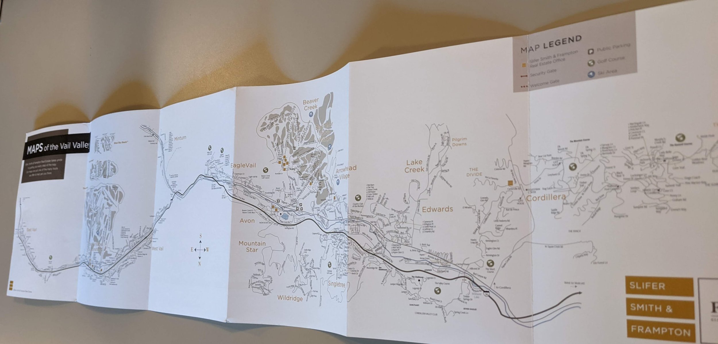
Market Maps –
One of the most challenging, and most rewarding, print projects I worked on were our market maps. When I started we used a variety of different maps, none of them with any visual or brand consistency between them, but they were still being used day in and out by our office staff so clearly a rethink was in order. I started with our most established map in Eagle County and brought it up to brand standard. With that look established I looked off to our other markets, most pressingly Summit County where a map pulled straight out of the 90s was still out in circulation. I modeled that map on the look established for Eagle County, but tailored to the unique needs of their market.
With these larger maps in-hand the team and I were well prepared to provide a number of more specific maps to our micro-markets. One that stands out in particular was the piece I created for the wall in our Keystone office that was getting remodeled. I hand-designed this 20-foot map to provide a compelling talking point for guests to the office. But to keep printing prices in check I designed the map with a series of insets that would allow us to highlight changing local businesses without having to redo the whole thing.

I worked out a unique fold with our printer that would make it feel like a trail map in the hand but avoid the dreaded “I can’t remember how to fold this damn map” conundrum.


My Keystone market map wound up spanning the width of our newly remodeled office in River Run Village.
THE RESULT:
During my first two financial years with the company they set a new sales record in 2020 and then proceeded to blow it out of the water in 2021. The markets were red hot, but our competitors were hot on our heels, these designs allowed the company to leverage favorable market conditions and our new partnership into record-setting growth. More importantly though, now the brand is well equipped to produce beautiful, consistent collateral for years to come which will always but the value of SSF first even as markets cool and competitors continue to nip at our heels.